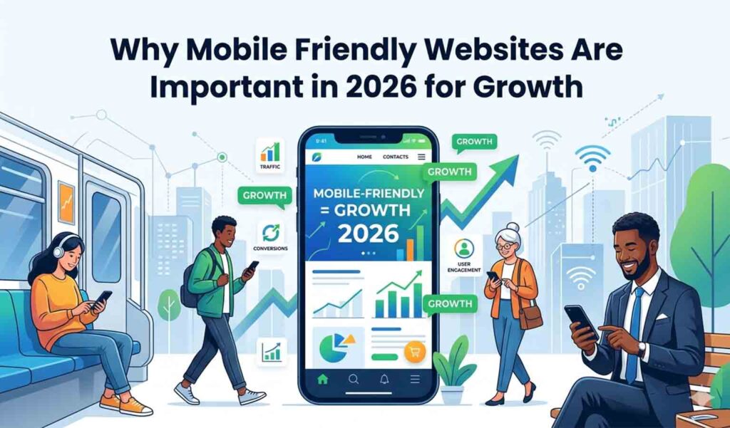
Why Mobile Friendly Websites Are Important in 2026

What is a Mobile-Friendly Website?
A mobile-friendly website is crafted to function seamlessly on smartphones and tablets. It automatically tweaks the layout, text, images, and buttons to fit those smaller screens, making navigation a breeze, speeding up loading times, and enhancing the overall user experience.
Why Mobile-Friendly Websites Matter in 2026
In 2026, having a mobile-friendly website isn’t just a nice-to-have; it’s a must for growing your business, boosting your SEO rankings, and improving user experience. With over 70% of users browsing on mobile devices, businesses that don’t have a mobile-friendly site risk losing out on customers and revenue.
If you want to build a mobile-friendly website for your business, check our Website Design & Development Services .
Key Benefits of Mobile-Friendly Websites
1. Enhanced User Experience
A mobile-friendly website guarantees:
- Easy navigation on smaller screens
- Text that’s easy to read without zooming
- Smooth scrolling and quick loading times
This leads to happier users and keeps visitors coming back for more.
2. Improved Google Rankings
Google prioritizes mobile-first indexing, which means:
- Your mobile version is the first to be considered
- Mobile-friendly sites enjoy higher rankings
- Non-optimized sites struggle to be seen
Having a mobile-friendly website can significantly boost your SEO performance.
3. Increased Conversions
Having a mobile-friendly website can really make a difference:
- It helps lower the bounce rate
- It boosts user trust
- It leads to more form submissions and sales
When users land on a well-optimized mobile site, they’re much more inclined to take action.
Turn your ideas into a high-converting website that drives results.
Contact Genesisads now for expert website design & development!
4. Faster Website Speed
Mobile-friendly websites are designed with speed in mind:
- Images are compressed
- The design is lightweight
- Loading times are quicker
Speed is crucial, not just for ranking but also for keeping users engaged.
5. Competitive Advantage
Businesses that embrace mobile-friendly websites can:
- Draw in more users
- Stay ahead of the competition
- Strengthen their online presence
By 2026, if your website isn’t mobile-friendly, you could be missing out on valuable business opportunities.
How Mobile-Friendly Websites Impact SEO
A mobile-friendly website boosts SEO in several key ways:
- Enhances page experience signals
- Lowers bounce rates
- Increases the time users spend on your site
- Supports Core Web Vitals
- Improves how easily search engines can crawl your site
Google is all about mobile-friendly websites, making them essential for ranking well in 2026.
Don’t Stop Here Read Our Next Blog On : What Is Zero Click Search-Definition ,Examples & SEO Impact.
Common Features of a Mobile-Friendly Website
A top-notch mobile-friendly website should have:
- A responsive design
- Quick loading times
- Easy-to-click buttons
- Optimized images
- A straightforward navigation menu
- Fonts that are easy to read on mobile
These features work together to create a smooth experience on any device.
People Also Ask
What happens if your website isn’t mobile-friendly?
If your website isn’t mobile-friendly, users will struggle with navigation, experience slow loading times, and find it hard to read your content. This can lead to higher bounce rates, lower search rankings, and a loss of potential customers in the mobile-first landscape of 2026.
How do mobile-friendly websites boost conversions?
Mobile-friendly websites enhance conversions by offering easy navigation, faster loading, and clear call-to-action buttons. This leads to a better user experience, builds trust, and encourages visitors to take actions like making purchases or filling out forms.
Is having a mobile-friendly website important for SEO in 2026?
Absolutely! A mobile-friendly website is vital for SEO in 2026. Google employs mobile-first indexing, which means that websites optimized for mobile devices will rank higher and perform better in search results.
What’s the difference between responsive and mobile-friendly design?
Responsive design automatically adapts to various screen sizes, while mobile-friendly design focuses on usability specifically for mobile devices. In 2026, responsive design is the best way to create a mobile-friendly website.
How can I check if my website is mobile-friendly?
You can find out if your website is mobile friendly by:
- Testing it on various devices
- Using Google’s Mobile Friendly Test tool
- Checking its loading speed and overall usability
How to Make Your Website Mobile-Friendly
Making your website mobile-friendly is easier than you think! Just follow these straightforward steps:
- Embrace responsive design
- Optimize your images and videos
- Speed up your website
- Choose easy-to-read fonts
- Steer clear of pop-ups on mobile
- Regularly test on various devices
By following these steps, you’ll ensure your mobile-friendly website runs smoothly and effectively.
Conclusion
In 2026, having a mobile-friendly website is a must for success. It enhances user experience, boosts your SEO rankings, increases conversions, and keeps your business competitive.
If your website isn’t mobile-friendly, you’re missing out on valuable traffic and potential customers every single day. Investing in a mobile-friendly site is one of the smartest moves you can make for long-term business growth.